Pericue
Multisensory Spatial Awareness System for Cyclists With Unilateral Hearing Loss
overview/background
BIndividuals with unilateral hearing loss often struggle with spatial localization, meaning they cannot accurately determine where sounds originate. This makes activities such as cycling in traffic significantly more challenging and sometimes unsafe. Recent multisensory research suggests that tactile and auditory cues can support spatial awareness by supplementing missing auditory information. This project explores a multisensory system that uses radar sensing, haptic feedback, and optional Bluetooth audio cues to enhance spatial understanding for cyclists with unilateral hearing loss.
goal
The goal of this project is to increase cyclists’ comfort, confidence, and trust as they navigate the road. To achieve this, the system aims to:
audience
The primary audience for this system is cyclists with unilateral hearing loss, particularly those who rely on biking as a primary mode of transportation or recreation. This group often faces heightened challenges related to spatial awareness, traffic cues, and environmental safety due to their reduced ability to localize sound. Within this audience, several sub-groups were considered:
Everyday Commuters: individuals who bike daily to school, work, or errands and depend heavily on environmental cues for safe navigation. They need an intuitive, non-visual system that integrates seamlessly into routine riding.
Recreational Cyclists: Users who ride for leisure or fitness but want additional reassurance and awareness in environments where vehicles, pedestrians, and terrain vary.
New or Nervous Riders: Individuals with unilateral hearing loss who may avoid biking in traffic due to safety concerns. This system aims to lower the barrier to cycling by building confidence and clarity.
visual design
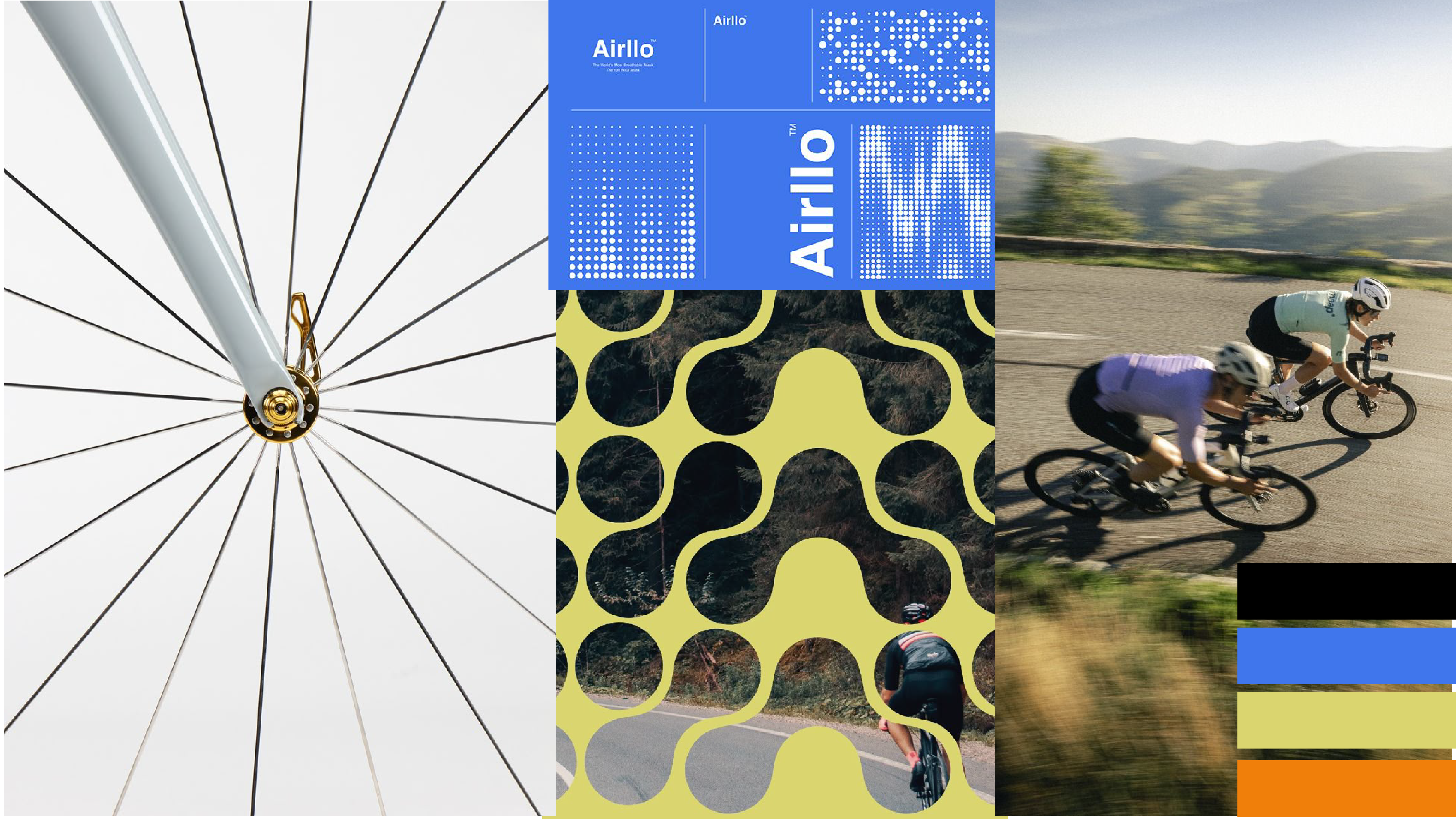
The visual identity combines elements of cycling culture, motion, and multisensory data to reflect how the system enhances spatial awareness. the thin lines represent radar sensing and vibration cues. The color palette remains simple yet bold, revolving around an electric blue to represent trust, and accountability. Together, these visuals create a look that feels dynamic, intuitive, and grounded in the sensory experience of cycling.

deliverables
brand identity design
product mock up
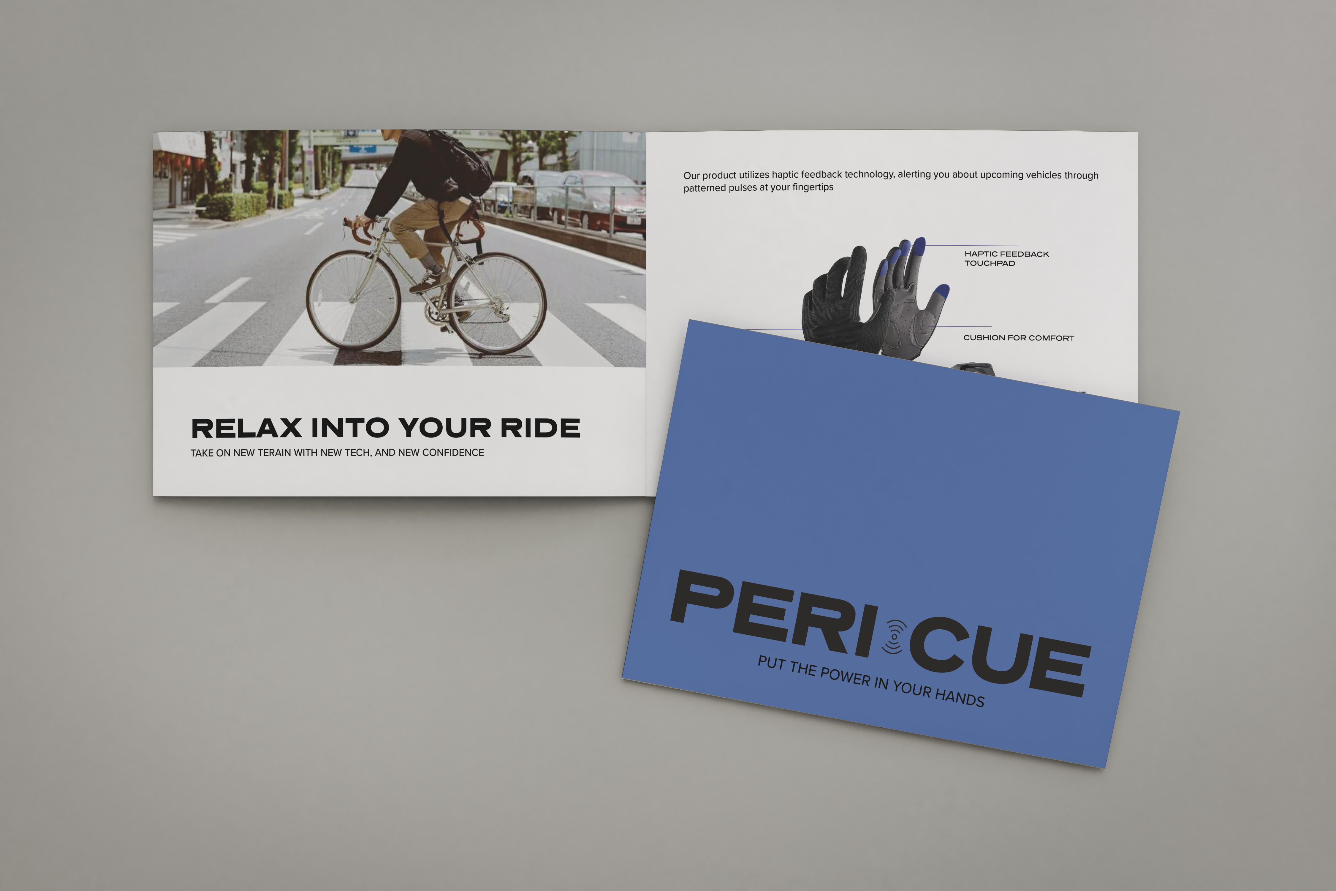
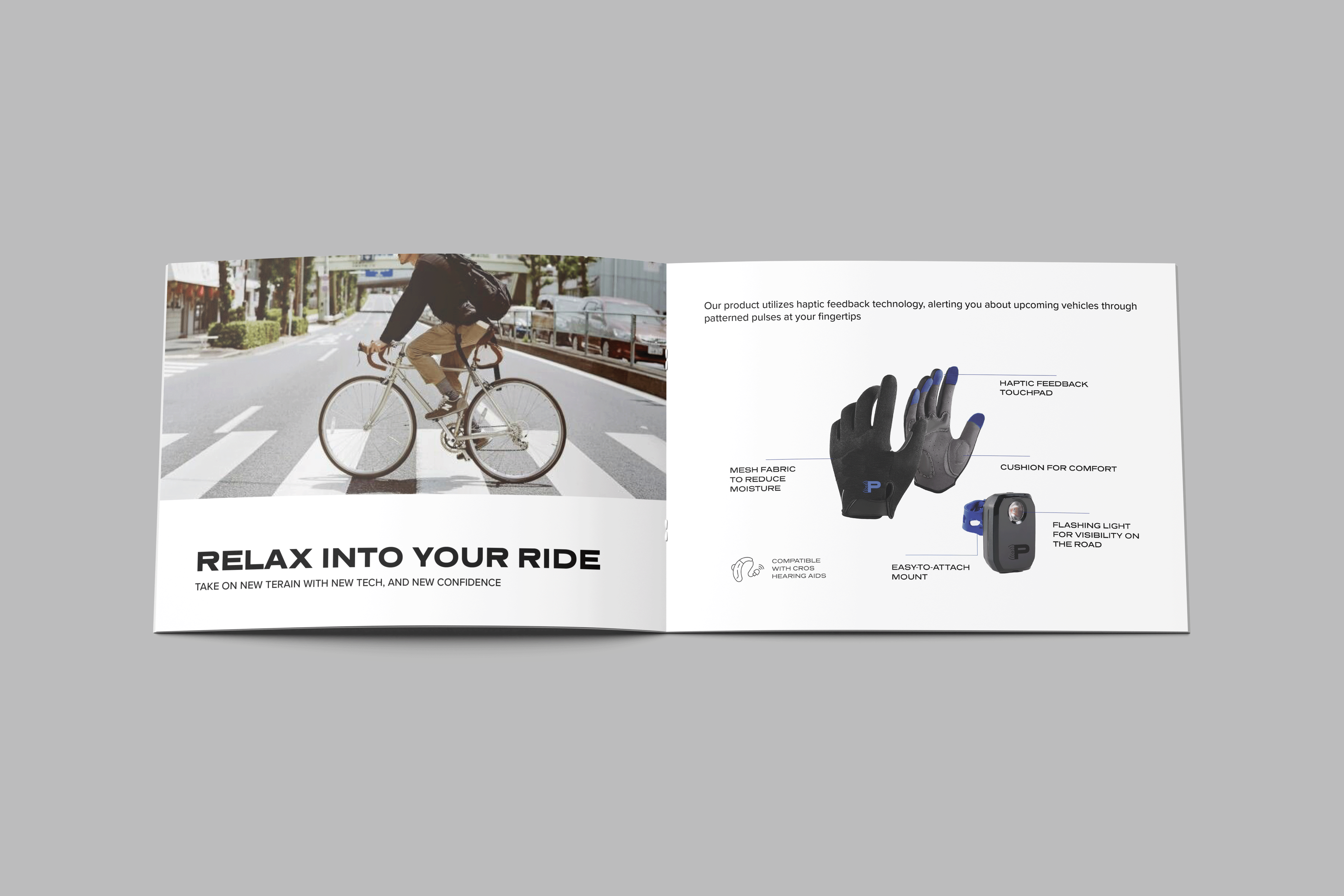
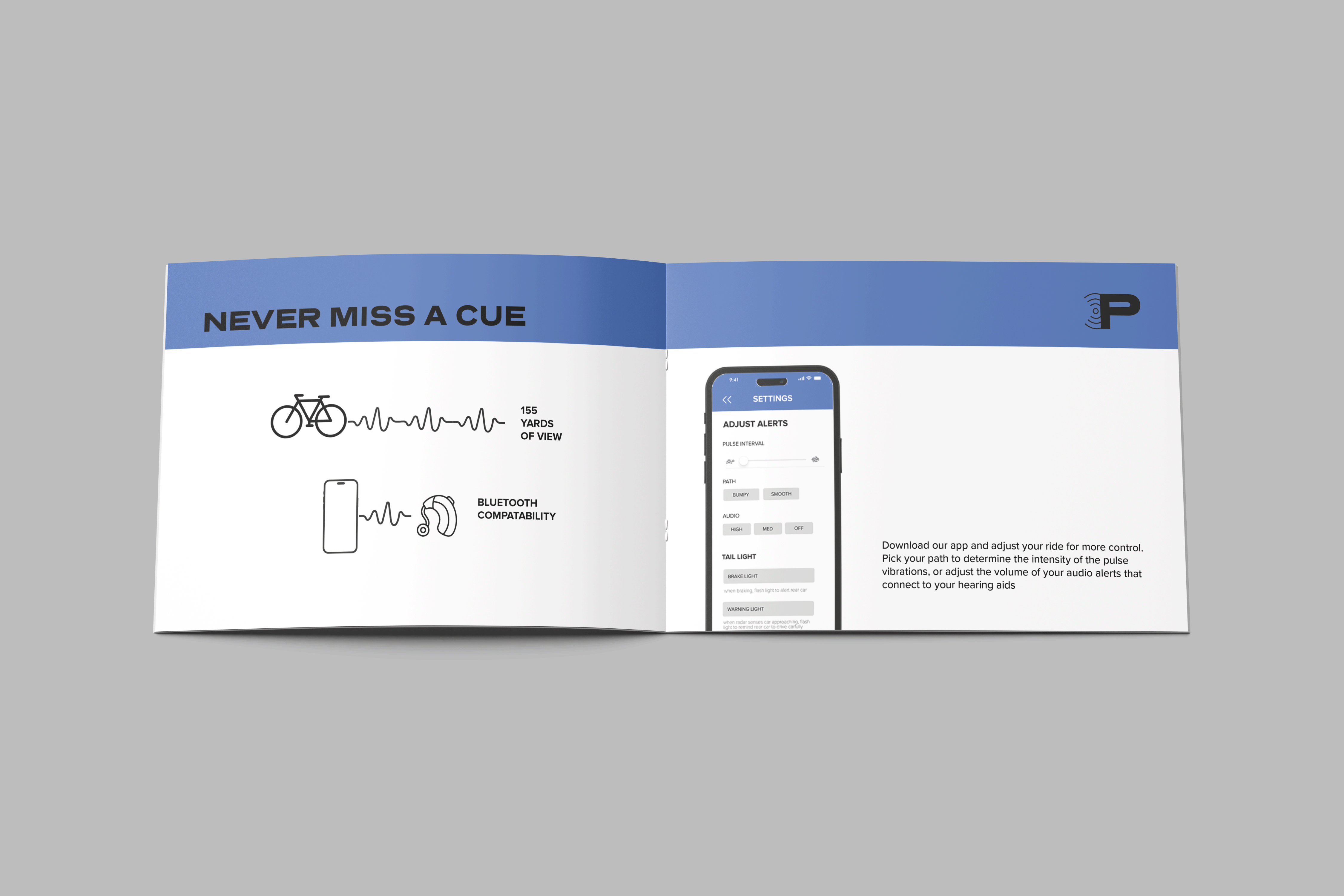
product booktlet
- Date:MAY 2024S


