Barebonez Collective
brand identity design case study
overview/background
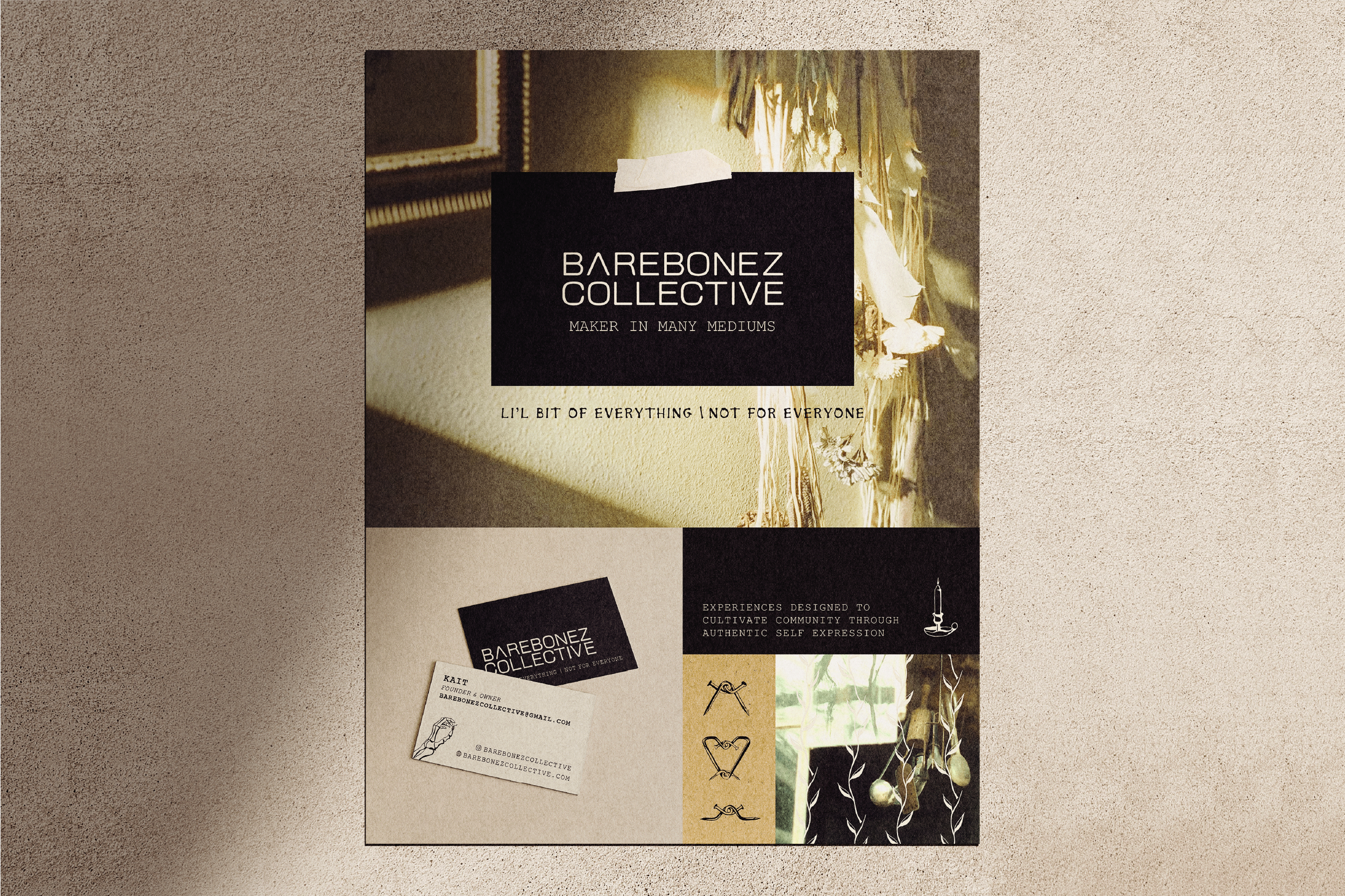
Barebonez Collective offers diverse, sustainably-minded and community-driven events and workshops in Denver. Pulled from their website, "the mission has always been to cultivate environments where creativity thrives, and everyone feels welcome to explore their artistic potential and curiosities."
objective
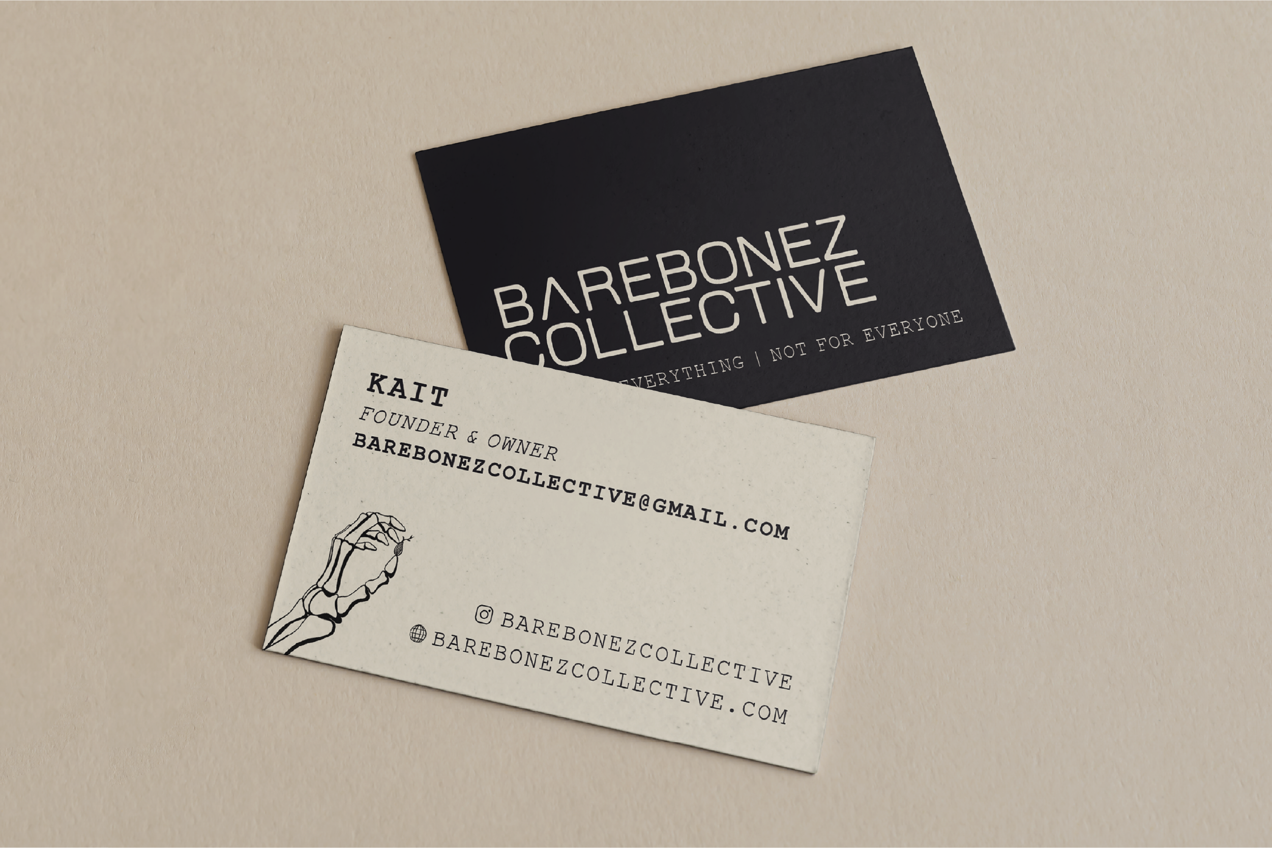
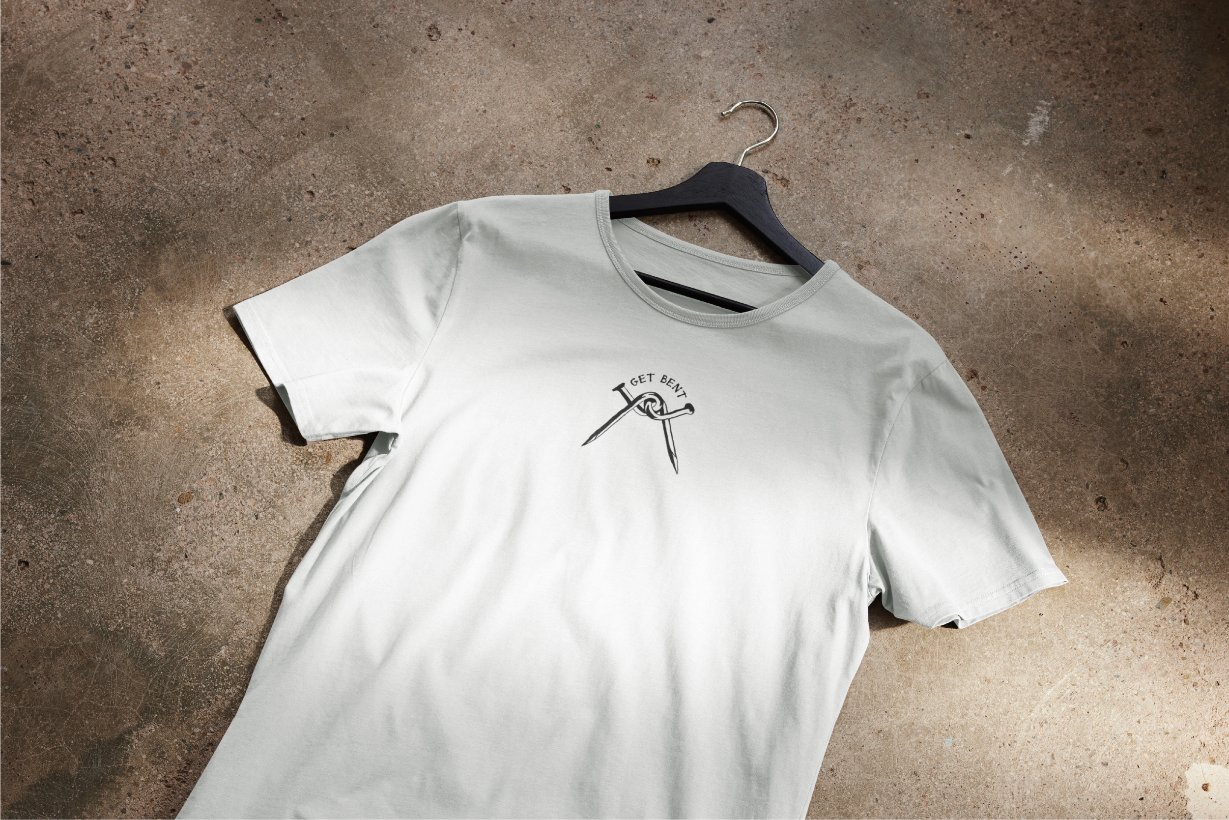
The owner of Barebonez Collective, Kait, is a dear friend of mine, and getting to capture her bold and unforgettable aura into a brand identity was an honor. Her personal catch-phrase has always been "a lil bit of everything, not for everyone." The goal for her identity design was to embody this contrast: a bold, fearless personal identity that fosters warm and honest community. Cohesion and flexibiltiy are important considerations, allowing the brand assets to be applied to varying solutions: unique event and workshop flyers, merch, watermarks, etc.
audience
Barebonez seeks to bring a variety of creatives together through diverse, sustainably minded events. The identity needs to resonate with dedicated creatives, and those interested in trying something new. these audiences can easily be divided into two groups, milennial and gen z. Milennials are the target audeince for Barebonez, as they are more likely to fill their free time with hobbies that provide structure, consistency, and reliability.
tone/sense
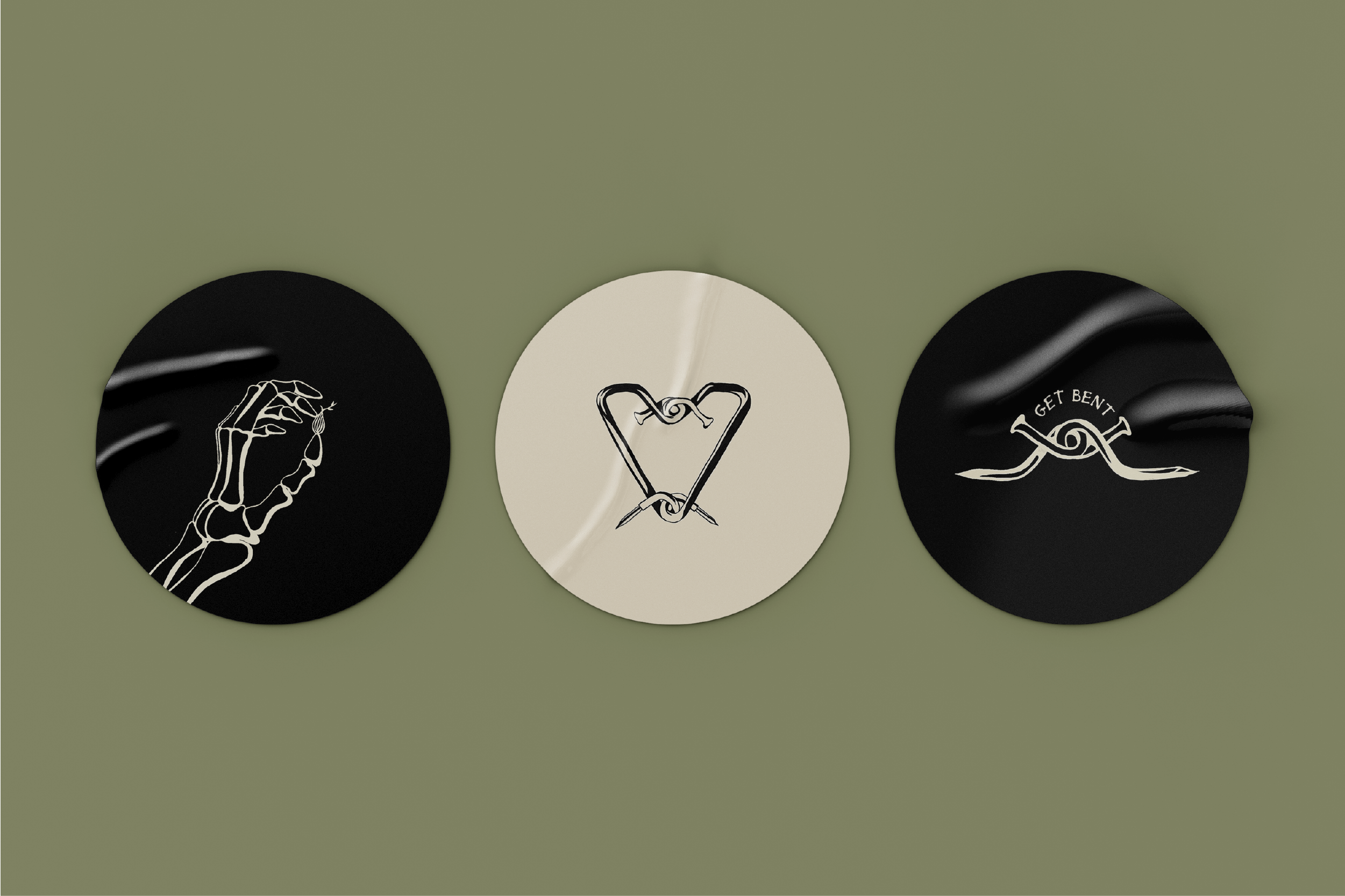
To empahsize the bold yet inviting nature of Barebonez, the visual identity combines clean, modern and structured typography with cozy colors and imagery. To add an edge, the brand illustrations are created with stark contrast between the line width and the open space.
deliverables
- Date:OCT 2025